
According to research conducted by PPG, while nearly 60 percent of consumers identified color as a major factor in their vehicle-buying decisions, automakers continue to sell a vast majority of cars (nearly 75 percent) in conservative colors such as white, black, gray and silver. In North America, white remains most popular (23 percent), followed by black (19 percent), gray (17 percent), silver (15 percent), red (10 percent) and blue (8 percent). sourced from corporate.ppg.com
“Our research indicates that global car manufacturers have good reason to give their brands and models a unique appearance using color and effects,” said Jane E. Harrington, PPG manager, color styling, automotive original equipment manufacturer (OEM) coatings. “Color and styling choices by OEMs must be responsive to these differences among potential buyers. They need to consider everyone from technology-focused millennials to family-focused baby boomers, monitoring sales data and style trends to try to predict two or three years in advance of a model year what colors and effects they will offer.
In response to the continued demand for color innovation in automotive coatings, PPG has introduced more than 60 exterior shades to manufacturers for consideration in styling 2018-2019 model year vehicles.
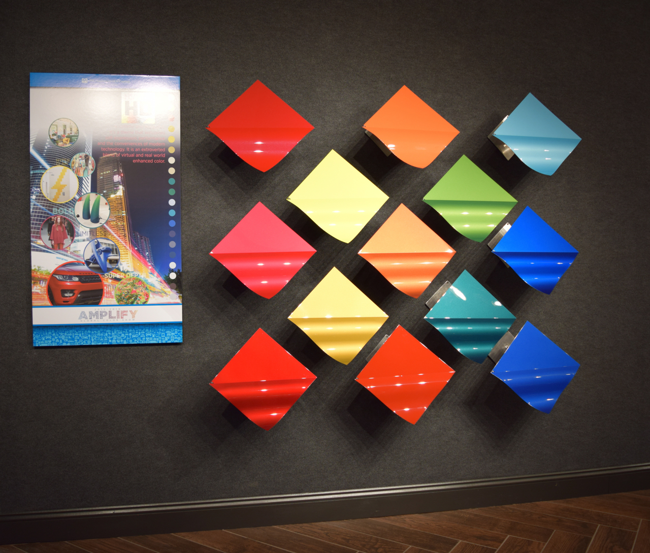
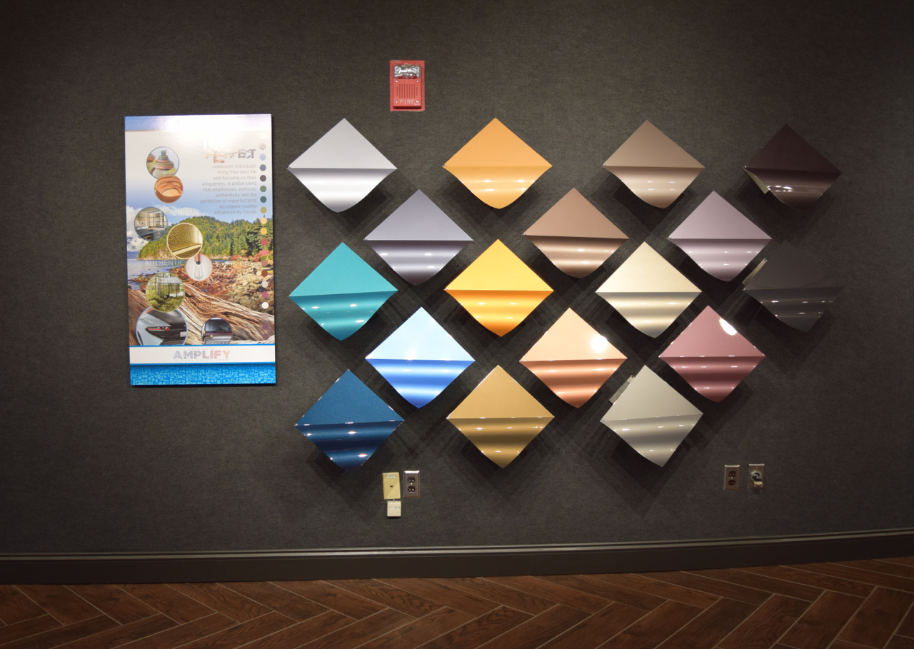
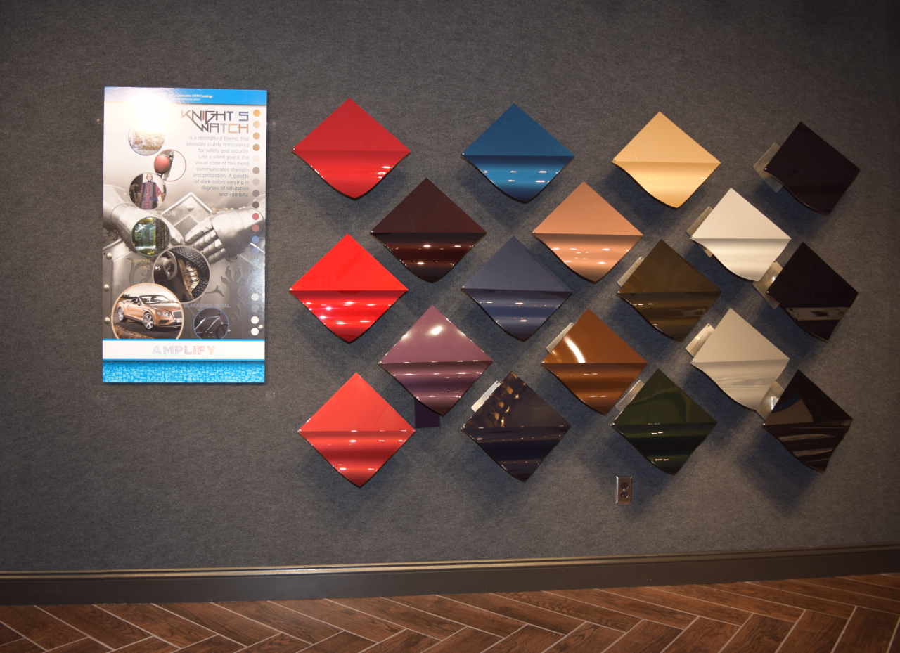
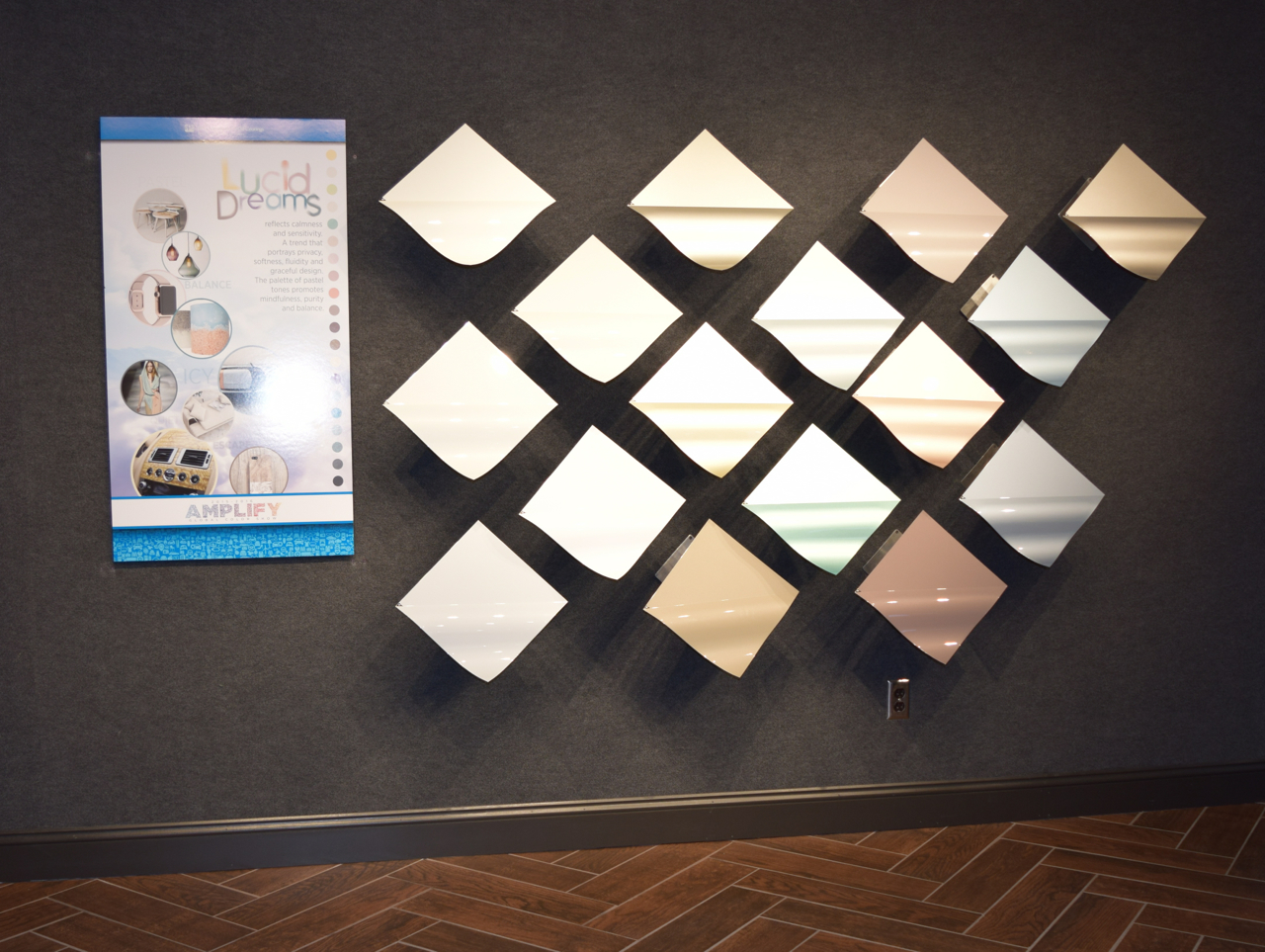
Titled “Colorography,” the collection includes four palettes:
- HYPER HD – is a colorful and impactful theme that welcomes self-expression, performance and modern technology. The palette includes an extroverted blend of virtual and real-world enhanced color – a mix of dazzling bright hues with the layered effects of tinted clears and tri-coats.
- IMPerfect – is a global trend named as a play on words, celebrating the perfection of imperfections and authenticity in individuals living their best lives and focusing on their uniqueness with an emphasis on wellness. This more organic palette is influenced by nature, with somewhat subdued hues such as foliage greens as well as copper and brass metal tones.
- Knight’s Watch – is a stronghold theme providing sturdy reassurance for safety and security through traditional colors representing refuge and confidence. Like a silent guard, the visual code of this palette communicates strength and protection with dark, dramatic jewel tones and blackened metal shades.
- Lucid Dream’s – reflects calmness, sensitivity and privacy, portraying a refuge from technology overload with fluid, graceful design. The palette consists of pastel tones with slightly more color as interpreted in metallic whites, mint greens, anodized gold/beige tones and sky blues
My two new favorite colors are the Lincoln MKX in platinum dune and the MKZ in palladium white gold metallic. Check out both at www.lincolncanada.com.